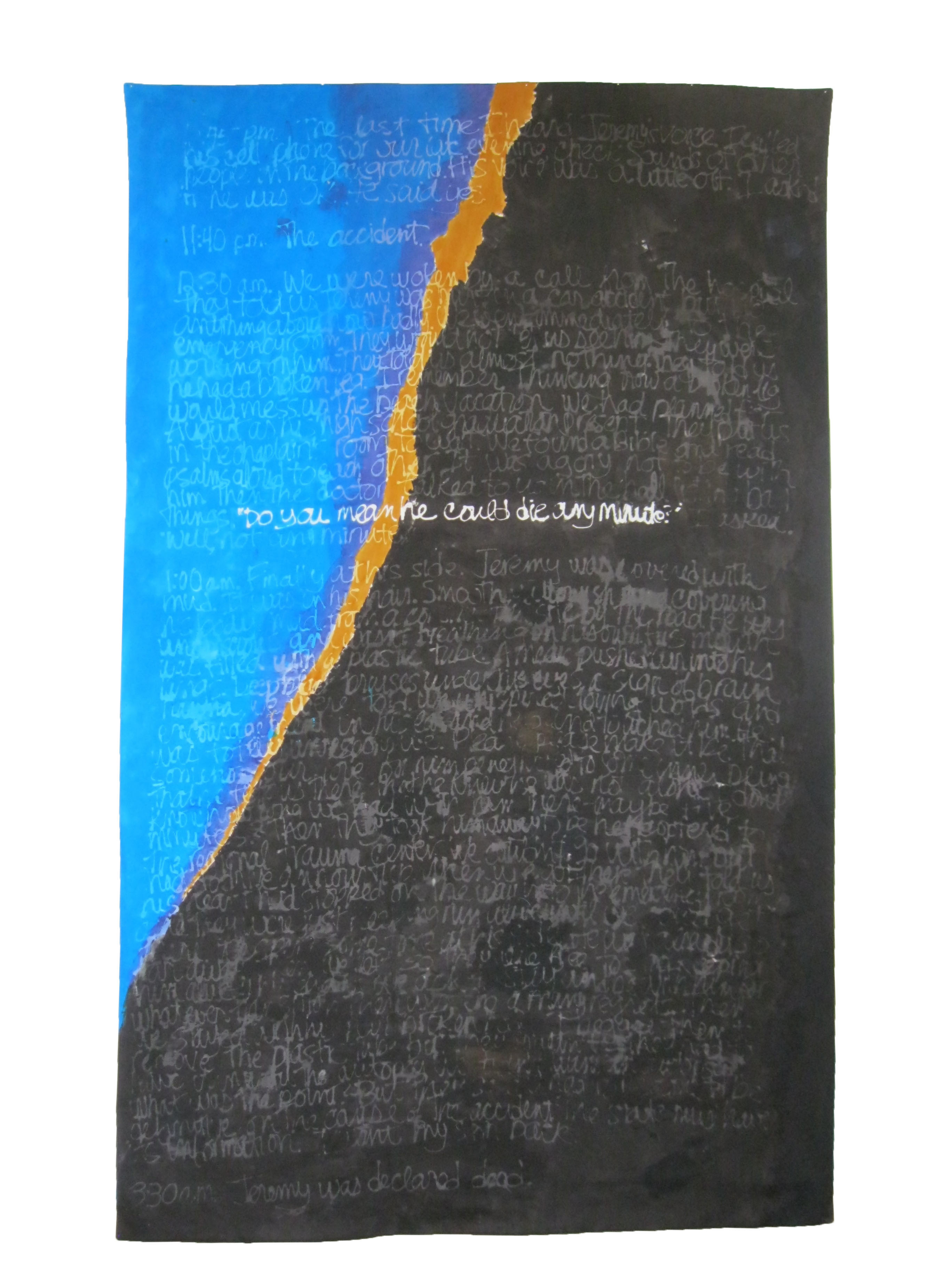
Accident
II (2015)
Hand-dyed
cotton;
screen-printed with paper lamination,
57
x
91 inches
With
most
of the quilts in this series, I know the quilt is done from a
visceral
feeling--yes, this is it. When I finished the mud-colored "Accident"
quilt, I felt that quilt was done, but that there was also more that
I wanted
to say. I had presented the narrative in a very controlled way, in
order to
keep the viewer centered on the factual content of the account.
Another part of
me wanted to express the violence of the accident and its emotional
aftermath.
For
"Accident
II," I wanted the viewer to be familiar with the narrative,
so that it could be recognized in the second piece, but without a
need to
decipher the obscured text. The focus instead is on expression
through color
and shape. While "Accident" is relatively small, forcing the viewer
close, into involvement with the text, "Accident II" is large. The
viewer needs to step back to take in the whole. My intent is that
the viewer,
familiar with the narrative, will here be drawn into the emotive
content.
Influenced
by
the work of Clyfford Still, I designed a composition that
incorporated a
jagged linethe divider between life and death (dyed the same color
as the
cloth in "Accident").
Technically,
this
was the most challenging piece in the series. The printing technique
was
learned in a 2014 workshop with textile artist Claire Benn. The
technique
allowed me to work very large: the print screen is polyester sheer
fabric with
the lettering fixed through paper lamination. The print table was a
repurposed
ping-pong table top, 60x108, padded and put on the floor so that I
could crawl
on it to pull the print. (Many thanks to Claire, who coached me over
the phone
from England on how to adapt the technique to a work of this size.)
After the
first pull, the lettering was white. I then over-dyed the piece so
that the
lettering was obscured, except for one sentence.
When the dyeing was done, I looked forward to months of hand-stitching, the work on my lap. But I decided that stitching would interfere with the piece rather than enhance it, so I just faced it with a fabric backing, no batting. I think of it as a kind of banner.