front
back
|
front
|
back
|
self-Portrait,
year
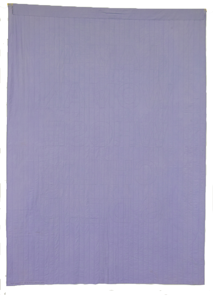
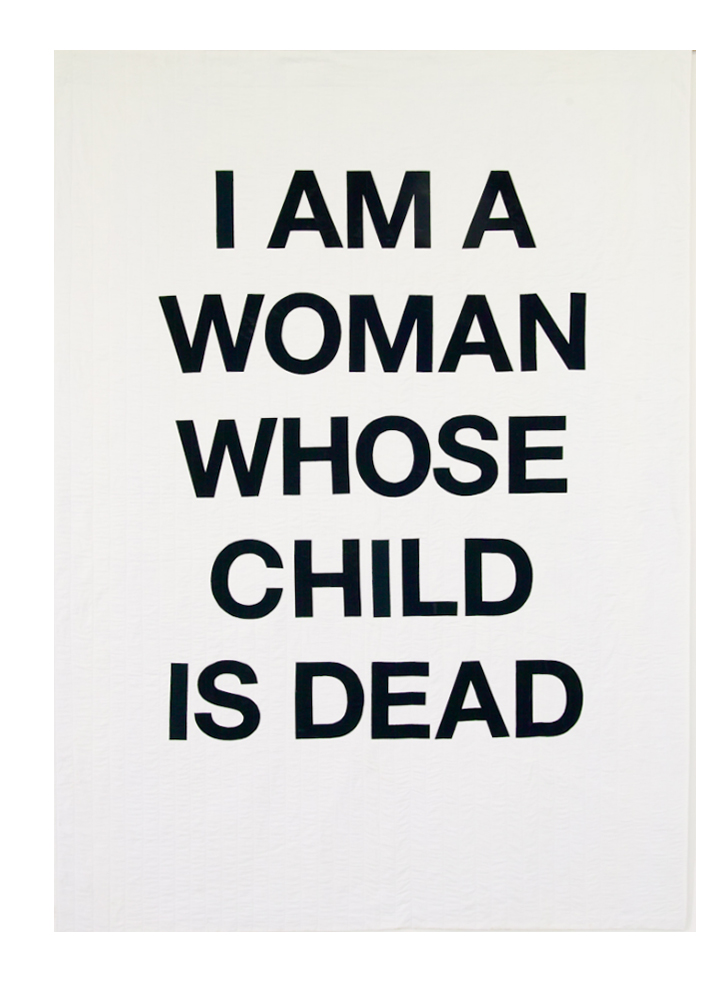
2: Beneath the surface
(2014)
Hand-dyed
cotton,
fused, felt batting, machine quilted
68
x 94 inches
The
idea for this quilt goes back to
2005/06, during the second year after Jeremy died. People expect that
the first
year after the death of a loved one it will be very difficult; but after
a
year, moving through one marker after another until the anniversary
arrives,
the expectation is that things will ease up. Indeed, that was my own
experience
after the death of both my parents in the winter of 2003. By the summer
of
2004, I was feeling I could get back to the normal run of life. But then
Jeremy
died. A year passed, and still, the loss continued to dominate my inner
life.
I
carried out daily life, as one has to
do. I taught my classes, attended meetings, laughed at jokes, and
responded to
friends. From the outside, the loss was invisible. But on the inside, I
continued to be shaped by loss, grief, and regret. In an early attempt
to
express this feeling of disjunction between outer appearance and inner
condition, I made a small maquette that put it in abstract form: a field
of
black patches in the bottom two-thirds of the rectangle, a lighter field
at the
top, and the two separated with a narrow band of lavender fabric that
represented my external appearance of equanimity.

Only
after choosing the color for the band did I learn from a friend
that lavender was the Victorian color of mourning, allowed after black
had been
worn for a period of time. A sliver of red was inserted in the black
field,
representing the stab of anguish that can surface without warning. I
liked this
design, but did not feel a push to take it further into the making of an
actual
quilt.
I
pursued another path, connected to the
memory of the yellowish mud that covered Jeremys body after the
accident, a
memory that haunted me. I looked for fabric just that color, and after I
learned to dye fabric, dyed many samples until I settled upon the hue
close to
my memory. In parallel, I thought about a statement that would reflect
how my
identity had changed since the loss of my son. I ended up with I am a
woman whose
child is dead. I searched for ways to inscribe the message in an
obscured way,
representing its invisibility to others.
An
early plan was to appliqué large
letters of the same fabric onto the mud-colored background; I also did
trials
just stitching letter patterns in the same color thread. At one point,
in 2012,
I was talking through the project with Bill Kerr. Ive been working on
how to
make the words only slightly visible, I said to Bill, to represent how
invisible my state of agitation is to everyone around me. But sometimes
I think
the quilt should scream out how I feelthat I should proclaim it in bold
black
and white. Maybe you should make two quilts, said Bill. These simple
words
of insight and affirmation were key to the development of the quilt. As
Bill
and I talked, we developed the idea of making two quilts, with the
intent to
show them at an exhibition in such a way that the hidden message quilt
would
be seen first, and then afterwards the bold quilt. I eventually changed
the
color of the first quilt from mud to lavender, pulling in the color from
the
strip of lavender in the earlier maquette. I dyed several versions of
lavender,
until I came up with precisely the dusky lavender that I had in my mind.
I also
moved from the idea of two quilts to one double-sided quilt, which was
completed in 2014. The mud colored fabric was transferred to a quilt
devoted to
the accident itself (Accident).
I
have shown this quilt in two other
settings. In both cases, the quilt was shown with the black/white side
forward.
I am grateful for this opportunity to show the quilt as I originally
intended.
If you look closely, the words are just barely visible on the lavender
side as
the stitching around the letters on the other side.
The fact that they are faint, and also
backwards, is a way of representing that the loss persists in the second
year
(and beyond), but it is difficult to perceive from the outside.
You have to be very close to see it. . .

This
was a technically challenging quilt
to make. Often, a final piece looks simple in design but is the result
of many
decisions on multiple fronts. Choosing what font to use for the message
was one
such decision. I am very satisfied with my final choice (Helvetica Neue
Bold),
but it came only after many weeks of trying out various fonts, reading
about
typography in general, and about Helvetica in particular. The size of
font to
use was another decision, and then figuring out how to print out letter
templates
that large. Tim Stedman of the Knox College Art Department and Bill Kerr
helped
with all things typographical.
How
to lay out the eight words of the
message was another decision. Should it be horizontal like a billboard,
which I
had in mind when choosing Helvetica; or should it be vertical? I chose
vertical
because it is closer to the human figure, and I think of this as a
self-portrait. I also had to decide how many lines the message would be,
and
where the line breaks would fall. Many versions were printed out in
small
format on the computer until I came up with the one that felt best to
me. I
enjoy hand appliqué, and assumed I would use that for fixing the letters
to the
background, but I decided that crisp edges and corners were more
important than
the pleasure of handwork, so I fused on the letters instead. I tried out
horizontal quilting lines, but decided on vertical, and then tried out
various
spacing for the vertical lines. I ended up with spacing just a little
narrower
than the width of the letter elements. I also tried out various
battings,
ending up with a layer of felt for the batting, as I wanted the quilt to
be
very flat.
When
this quilt was shown in 2015 at
QuiltCon (a national show for modern quilting), it created a stir,
leading to
two published interviews with me and many postings on social media.
I was humbled by the response, and gratified
to know that my work could touch others deeply--both those who have
suffered
deep loss themselves, and those who haven't, but who appreciate this
glimpse
into the world of loss.
I
look back through my notes and samples,
done over a period of nine years, and marvel at the ideas
permutations. The
measure of the quilts success for me is looking at it and knowing I
would not
change anything.